


Winsor & Newton Revival Colours: A Timeless Palette for Modern Artists
Author: The Art Shed Team Date Posted:17 February 2025
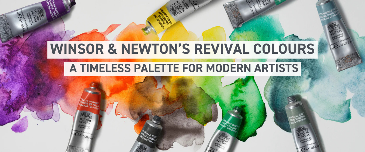
Winsor & Newton’s Revival Colours: A Timeless Palette for Modern Artists
Winsor & Newton has resurrected some of their most iconic discontinued colours, now reimagined with modern permanence, sustainability, and superior mixing versatility.
Once loved by royalty, master painters, and colour theorists, these shades return with enhanced lightfastness and usability, making them a must-have for today’s artists.
The Revival Collection transports your palette to a tropical paradise filled with sun-drenched oranges, lush greens, deep ocean blues, and regal purples.
Whether you're capturing golden sunsets, rainforests, or rich historical themes, these colours unlock endless creative possibilities.
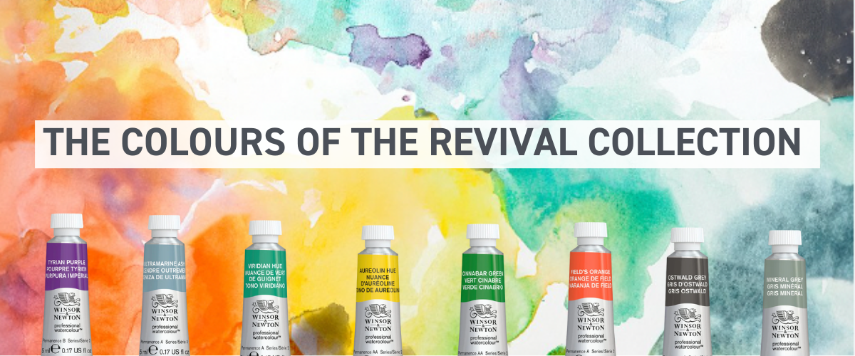
THE COLOURS OF THE REVIVAL COLLECTION
TYRIAN PURPLE – The Colour of Kings
Deep, intense purple with a pink-red undertone, historically extracted from Mediterranean sea snails.
Prized by Roman emperors, Byzantine royalty, and Renaissance painters.
Now reformulated to be lightfast, vibrant, and sustainable.
Art Sheds Tip! This colour is best for Regal florals, bold abstracts, and deep shadows.
FIELD’S ORANGE – The Renaissance Glow
A single-pigment, high-chroma red-orange, inspired by George Field’s legendary vermillion.
Featured in Queen Victoria’s personal watercolour box.
Brings a dynamic, fiery warmth to your palette.
Art Sheds Tip! This colour is best for: Luminous portraits, sunset hues, and Old Master-inspired works.
AUREOLIN HUE – Sunlit Brilliance
A bright, transparent yellow that’s a modern alternative to cobalt yellow.
Originally introduced by Winsor & Newton in 1831.
Offers clarity and brilliance, making it perfect for colour mixing.
Art Sheds Tip! This colour is best for Sunlight effects, botanical details, and layering.
VIRIDIAN HUE – The Ocean’s Depth
Transparent cool green with a blue undertone, closely matching historical Viridian.
Originally loved by Impressionists and Post-Impressionists originally loved Van Gogh's luminous quality.
Mixes well with yellows for vibrant foliage and blues for rich shadows.
Art Sheds Tip! This colour is best for Seascapes, tropical greenery, and atmospheric effects.
CINNABAR GREEN – Historic Elegance in a Single Brushstroke
A bold yellow-green inspired by 18th-century copper-based pigments.
Featured in Winsor & Newton’s historic tint books.
Offers a unique golden undertone, ideal for natural gradients.
Art Sheds Tip! This colour is best for Verdant foliage, layered colour washes, and blending.
ULTRAMARINE ASH – Soft Sky & Dreamy Depths
A delicate, transparent grey-blue with a soft granulation effect.
Historically an inferior grade of Ultramarine but prized for muted, ethereal tones.
Ideal for soft, atmospheric shadows and dreamy cloudscapes.
Art Sheds Tip! This colour is best for Skies, seascapes, and delicate washes.
MINERAL GREY – Earthy, Natural, Timeless
A semi-transparent grey-green, providing soft toning and subtle depth.
Offers a natural alternative to harsh blacks.
Perfect for tonal studies and landscape painting.
Art Sheds Tip! This colour is best for Monochrome sketches, soft shadows, and misty effects.
OSTWALD GREY – The Perfect Warm Neutral
A warm, opaque grey with granulating texture.
Named after Wilhelm Ostwald, a scientist and colour theorist.
Offers a sophisticated alternative to stark blacks and whites.
Art Sheds Tip! This colour is best for Subtle toning, underpainting, and refined shading.
Click here to download the full Winsor & Newton Watercolour Colour Chart
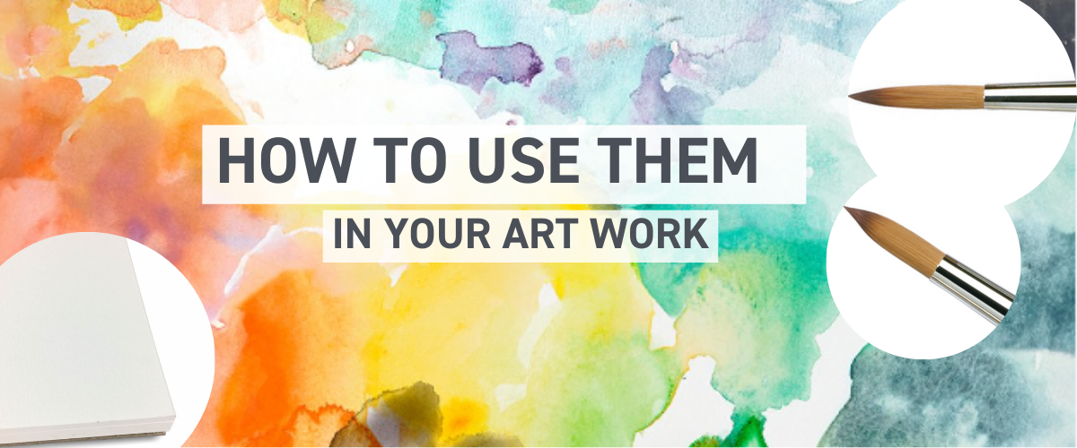
These colours offer remarkable mixing potential, layering effects, and unique tonal variations. Here’s how to incorporate them into your art:
1. Mix for Unique Colour Combinations
Tyrian Purple + Aureolin Hue = Vibrant, Sun-Kissed Magenta
Field’s Orange + Viridian Hue = A Rich, Muted Olive Green
Ultramarine Ash + Mineral Grey = A Soft, Dreamy Shadow Tone
Pro Tip: Layer thin washes to build depth and allow the granulating colours to shine
2. Use for Glazing & Layering
Aureolin Hue and Cinnabar Green create luminous landscape layers.
Ultramarine Ash and Ostwald Grey blend beautifully for subtle atmospheric shifts.
Viridian Hue adds a cool glow to portrait shadows when layered.
Try This: Apply a thin wash of Field’s Orange under a deep Tyrian Purple to create radiant, Old Master-inspired glazes.
3. Enhance Contrast & Depth
Tyrian Purple is excellent for deep shadows in floral paintings.
Mineral Grey and Ostwald Grey work well as soft alternatives to black.
Field’s Orange creates stunning highlights in warm-toned artwork.
Experiment: Use Ultramarine Ash as an alternative to cool shadows instead of straight black or blue.